Welcome to my blog. Here you will find research and planning construction evidence and evaluation for my AS foundation portfolio.
Home
Thursday, 22 March 2012
rough cuts
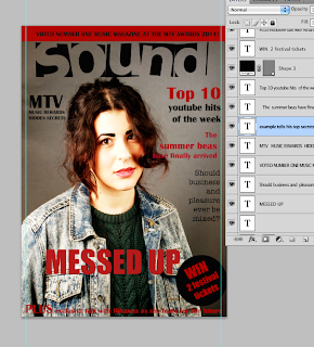
These are examples of the rough cuts i experimented with on my front cover. I tried looking at different colours images, layout and fronts to see what looked mostt pofessional. My final design ended up very different as i didnt use a variety of colours i stook to one main colour-red then used black and white as my other fonts and background colours keeping it very simple. I did this because when looking at other examples i experimented with the ones with less colour looked more professional. Also i followed the style and layout of other professional magazines which proved that most professional magazines did not use alot of colour.
Subscribe to:
Post Comments (Atom)


No comments:
Post a Comment