Welcome to my blog. Here you will find research and planning construction evidence and evaluation for my AS foundation portfolio.
Home
Saturday, 24 March 2012
build up& improvements of contents
Origionally i was just going to have 'contents' at the top of my contents page as i noticed this was a common feauture on many other real magazines.
I then decided despite wanting to keep it very similar to professional magazines i wasnt it to be a little more indervidual, consequently took another approach to the sub heading of contents and used the term 'this week'.
The final product for the contents page kept the same sub heading of 'this week' however there was a few changedsmade with the layout ensuring it looked of a professional quality. One of the edits was i noticed i hadnt used a capital letter on my first draft so this was an immediate change. I changed the font as it was previously the same font as what wa soriginally on my front cover but due to that also changing i chnaged the contents font to maintain a strong house style throughout the magazine. I alos think the solid background behind the white block texts makes it stand out more but also keeps the conetents page looking neat and organsised.
Thursday, 22 March 2012
rough cuts
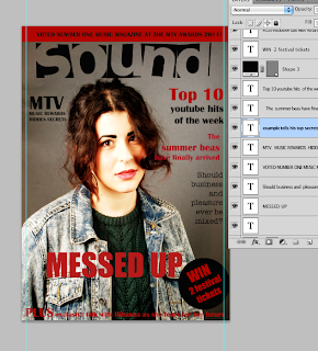
These are examples of the rough cuts i experimented with on my front cover. I tried looking at different colours images, layout and fronts to see what looked mostt pofessional. My final design ended up very different as i didnt use a variety of colours i stook to one main colour-red then used black and white as my other fonts and background colours keeping it very simple. I did this because when looking at other examples i experimented with the ones with less colour looked more professional. Also i followed the style and layout of other professional magazines which proved that most professional magazines did not use alot of colour.
Friday, 16 March 2012
Here is the build up of my main page article, originally there was more images on but i edited this to make it look what i thought appeared more professional.Research showed me that one large image is commonly used to fill a full page while the one next to it provides the text. I then edited the background from white to the same color background as the A4 image provided. i created this shading of colour on photo shop then blended them together.
Thursday, 15 March 2012
Subscribe to:
Posts (Atom)