Audience feedback
Friday, 13 April 2012
Wednesday, 11 April 2012
question 4
Who would be the audience for your media product?
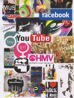 This is a readers profile which contains images of interests of my target audience. The image range from high street fashion shops they might shop from to gig and festive images and things they might enjoy. The is a large variety of images pressing the fact that the magazine genre is for a wide audience range. This reader profile includes atleast one thing that the target audience will be interest in.
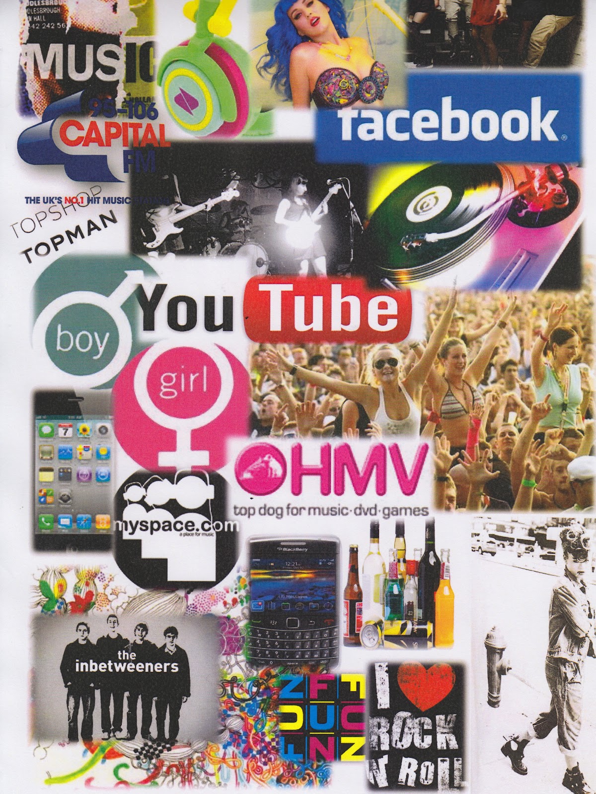
Above is a visual representation of who the audience is for my media product. The poster includes music interests, common hobbies, fashion brands, target age and the gender of my audience.
After doing the original audience research, I decided that my audience would be of both male and females, with a larger proportion of 60% being female and 40% to male. From the content of my image, it includes a varied range of photography including both male and female.
With age, my audience generates between 15-25 which is a relatively young audience, but with this generation - they are most likely to be easily influenced which is important when creating a media product.My research also told me that it is people of this age who tend to buy the most magazines, particularly music magazines are around this age category
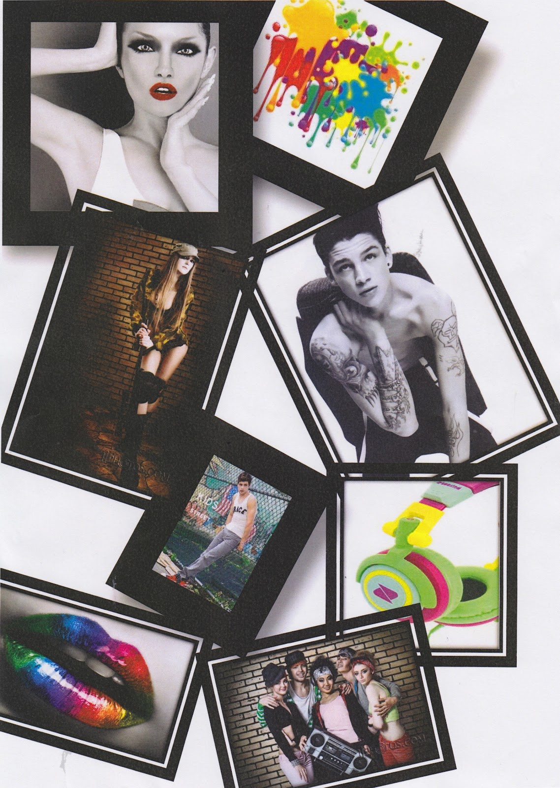
 This is a readers profile which contains images of interests of my target audience. The image range from high street fashion shops they might shop from to gig and festive images and things they might enjoy. The is a large variety of images pressing the fact that the magazine genre is for a wide audience range. This reader profile includes atleast one thing that the target audience will be interest in.
Above is a visual representation of who the audience is for my media product. The poster includes music interests, common hobbies, fashion brands, target age and the gender of my audience.
After doing the original audience research, I decided that my audience would be of both male and females, with a larger proportion of 60% being female and 40% to male. From the content of my image, it includes a varied range of photography including both male and female.
With age, my audience generates between 15-25 which is a relatively young audience, but with this generation - they are most likely to be easily influenced which is important when creating a media product.My research also told me that it is people of this age who tend to buy the most magazines, particularly music magazines are around this age category
Friday, 6 April 2012


Thursday, 5 April 2012
Tuesday, 3 April 2012
Evaluation 1
Question 1
- In what way does your media product use, develop or challenge forms of real media product.
The above prezi highlights the similarities which i have used to create a product which looks as real as possible to a professional magazine. It also shows how it appeals to my target audience.
Saturday, 24 March 2012
build up& improvements of contents


Origionally i was just going to have 'contents' at the top of my contents page as i noticed this was a common feauture on many other real magazines.
I then decided despite wanting to keep it very similar to professional magazines i wasnt it to be a little more indervidual, consequently took another approach to the sub heading of contents and used the term 'this week'.

Thursday, 22 March 2012
rough cuts


These are examples of the rough cuts i experimented with on my front cover. I tried looking at different colours images, layout and fronts to see what looked mostt pofessional. My final design ended up very different as i didnt use a variety of colours i stook to one main colour-red then used black and white as my other fonts and background colours keeping it very simple. I did this because when looking at other examples i experimented with the ones with less colour looked more professional. Also i followed the style and layout of other professional magazines which proved that most professional magazines did not use alot of colour.
Subscribe to:
Posts (Atom)