Welcome to my blog. Here you will find research and planning construction evidence and evaluation for my AS foundation portfolio.
Home
Wednesday 18 April 2012
Question 7
Looking back at you preliminary task how have you processed from production of it to full product.
(top 3 images are my final production, last two are the preliminary task.
The difference between my preliminary task and final product with concerns to the research was defiantly due to the time construction. I had a very limited amount of time on the preliminary task to do research therefore my over all research for it was of much less depth.
In my final product I researched several into much more depth getting a better understanding of: font style, target audience, gender, genre, colour, photograph styles and skills etc. The internet played a much bigger role in my research for the final product however I also did a lot more primary research as well.
Despite the research being very time consuming, it was certainly a vital part in the product of the magazine ensuring I was able to create a professional product of good quality with realistic features.
Where as in my preliminary I only had three weeks to research and create the overall product I had much more time for the final piece allowing time to create and overall better product. I kept to a much tighter time schedule ensuring meet deadlines and worked in the way a real media producer would have too. Part of this timing process included me having too book models and arrange times, book the studio an cameras so I knew when I would be doing my photo shoots and I could schedule this into my blogger diary and could organise other things around it. I was working by a weekly plan and knew what I had to do every week to ensure I would get everything done.
The quality of the images in my final product in comparison to my preliminary task prove that I have learnt new skills and techniques based on my camera work .The use of certain colours, font s and text size all suggest certain meaning and reflect on the genre and style of the magazine. These factors are something which I considered much more in the final product as I spent more time researching them and realising their importance.
The layout of my preliminary product was very badly organised and after comparing it to my final product I have noticed many faults with it. I have picked up on these points as after producing final product I have a better knowledge about what is appropriate for this type of media product and I have learnt many new skills on my way helping me produces higher quality work. On my final product I used indesign and photo shot to help me use a more professional layout as I created lines and columns to get a professional look and organise my layout. When comparing my sky lines and mast heading I can see how much photo shop has helped me as it has allowed me to create a more professional look and they both now stand out more and fit the genre of my music magazine.
Monday 16 April 2012
Question 7
Looking back at you preliminary task how have you processed from production of it to full product.
Final product:
The difference between my preliminary task and final product with concerns to the research was defiantly due to the time construction. I had a very limited amount of time on the preliminary task to do research therefore my over all research for it was of much less depth.
In my final product I researched several into much more depth getting a better understanding of: font style, target audience, gender, genre, colour, photograph styles and skills etc. The internet played a much bigger role in my research for the final product however I also did a lot more primary research as well.
Despite the research being very time consuming, it was certainly a vital part in the product of the magazine ensuring I was able to create a professional product of good quality with realistic features.
Where as in my preliminary I only had three weeks to research and create the overall product I had much more time for the final piece allowing time to create and overall better product. I kept to a much tighter time schedule ensuring meet deadlines and worked in the way a real media producer would have too. Part of this timing process included me having too book models and arrange times, book the studio an cameras so I knew when I would be doing my photo shoots and I could schedule this into my blogger diary and could organise other things around it. I was working by a weekly plan and knew what I had to do every week to ensure I would get everything done.
The quality of the images in my final product in comparison to my preliminary task prove that I have learnt new skills and techniques based on my camera work .The use of certain colours, font s and text size all suggest certain meaning and reflect on the genre and style of the magazine. These factors are something which I considered much more in the final product as I spent more time researching them and realising their importance.
The layout of my preliminary product was very badly organised and after comparing it to my final product I have noticed many faults with it. I have picked up on these points as after producing final product I have a better knowledge about what is appropriate for this type of media product and I have learnt many new skills on my way helping me produces higher quality work. On my final product I used indesign and photo shot to help me use a more professional layout as I created lines and columns to get a professional look and organise my layout. When comparing my sky lines and mast heading I can see how much photo shop has helped me as it has allowed me to create a more professional look and they both now stand out more and fit the genre of my music magazine.
Sunday 15 April 2012
question 6
Evaluation Question 6 - What have you learnt about technologies from the process of constructing this product?
I used an imac for all of my research,planning and production, I used this imac because of the wide range of professional programmes on it that allowed me to ake my product look professional. I made use of the programmes the imac had to offer such as:
These products gave me the oppertunity to prodcue proffesional work and get good results. I created my front cover on photo shop and my contents and main page on indesign. However all the images used through my magazine on my front cover, but also contents and main page article as well were all edited on photo shop.
I took all of my pictures with a professional camera-canon to get the best quality photos i could. When taking pictures in the studio I also used a professional lighting set up, this meant I was able to change the settings of the camera and lights to create the image i wanted. I was able to eliminate shadows by being able to change the lighting settings which also allowed me to chnage the brightness and contrast-this became a very important element of the camera work.
Due to all the camerawork i have done not only in the final product but also the build up I have learnt different techniques to take different photos, and learnt different ways teh best resulty from a photo.
Friday 13 April 2012
question 5-How did you attract/ adress yoiur audience?
Audience feedback
Wednesday 11 April 2012
question 4
Who would be the audience for your media product?
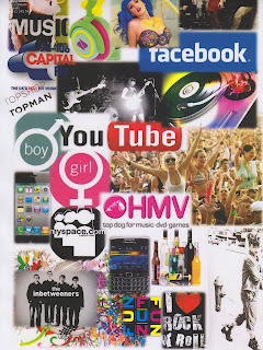
Above is a visual representation of who the audience is for my media product. The poster includes music interests, common hobbies, fashion brands, target age and the gender of my audience.
After doing the original audience research, I decided that my audience would be of both male and females, with a larger proportion of 60% being female and 40% to male. From the content of my image, it includes a varied range of photography including both male and female.
With age, my audience generates between 15-25 which is a relatively young audience, but with this generation - they are most likely to be easily influenced which is important when creating a media product.My research also told me that it is people of this age who tend to buy the most magazines, particularly music magazines are around this age category
This is a readers profile which contains images of interests of my target audience. The image range from high street fashion shops they might shop from to gig and festive images and things they might enjoy. The is a large variety of images pressing the fact that the magazine genre is for a wide audience range. This reader profile includes atleast one thing that the target audience will be interest in.
Above is a visual representation of who the audience is for my media product. The poster includes music interests, common hobbies, fashion brands, target age and the gender of my audience.
After doing the original audience research, I decided that my audience would be of both male and females, with a larger proportion of 60% being female and 40% to male. From the content of my image, it includes a varied range of photography including both male and female.
With age, my audience generates between 15-25 which is a relatively young audience, but with this generation - they are most likely to be easily influenced which is important when creating a media product.My research also told me that it is people of this age who tend to buy the most magazines, particularly music magazines are around this age category
Friday 6 April 2012
Thursday 5 April 2012
Tuesday 3 April 2012
Evaluation 1
Question 1
- In what way does your media product use, develop or challenge forms of real media product.
The above prezi highlights the similarities which i have used to create a product which looks as real as possible to a professional magazine. It also shows how it appeals to my target audience.
Subscribe to:
Posts (Atom)